As described in the article, Applying specific filters to homes, organizations with an active Community Connector subscription will have the 'Length of Residence' layer in the 'Households' section be turned on by default. This will cause colored household icons to appear on the map.
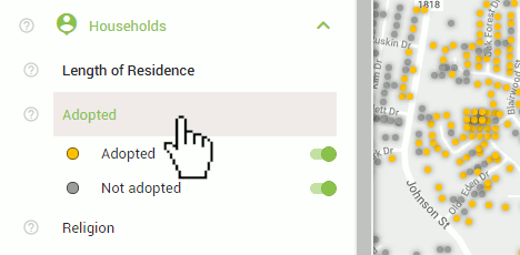
If you do not have colored icons on the map and you do have an active Community Connector subscription, you will need to first turn on the layer. To do this, simply click 'Households' on the control panel to see the selection of available layers, and then click any of the layers. For the example below, we are clicking the 'Adopted' layer. Once you have clicked a layer, it will turn green and will show the toggles within that layer. You should also see the individual households appear on the map represented as colored circles or squares depending on your current zoom level.

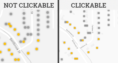
In order to view the name and a summary of the likely attributes of the primary adults of that household, the households on the map must be squares. If they are circles, you will need to zoom in to make them clickable. When your map scale is 50m/200ft or less, the households will be presented as squares. You can check the current map scale in the bottom-right corner of the map.
Click any of the squares to see the summary of information for that household.
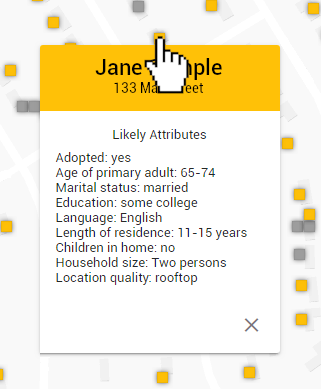
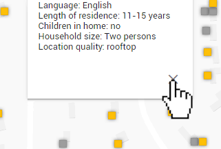
To close the info-box, click the 'X' in the bottom-right corner of the box. If you click a different household, the currently open info-box will close and the new one you have selected will open.
