In Blesseveryhome, a cluster analysis allows you to view a breakdown of the percentage of occupation in certain predefined regions by your organization's constituents. To put it another way, this allows you to see where your constituents are concentrated and can possibly help you in building close-knit communities within your organization by introducing people who may not know each other, but live close by.
In order to view an analysis of your attenders on the map, you will first need to have uploaded attenders into your organization's account. Please see this article for instructions:
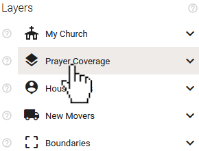
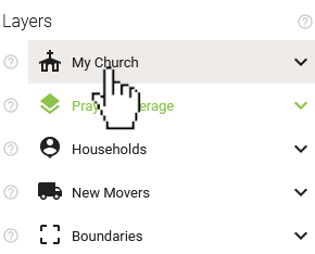
To view a Cluster Analysis of your uploaded attenders, navigate to the 'Layers' section of the Map's control panel and click the 'Prayer Coverage' layer.
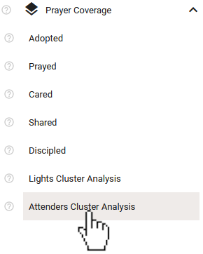
Once the 'Prayer Coverage' layer is expanded, select 'Attenders Cluster Analysis' from the expanded list.
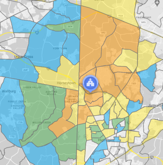
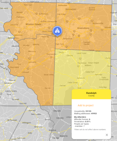
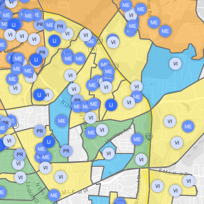
Doing so will cause boundaries to appear on the Map. You may want to zoom out on the map to get a better view. The boundaries you will see are Census Block Groups (CBGs). We sometimes refer to these regions as neighborhoods.
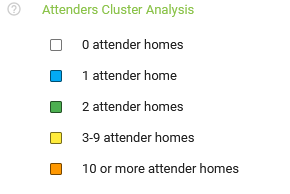
The control panel will provide a legend for the map while that layer is expanded to help you decipher the information.
Clicking within any of the shaded CBGs will give you more information.
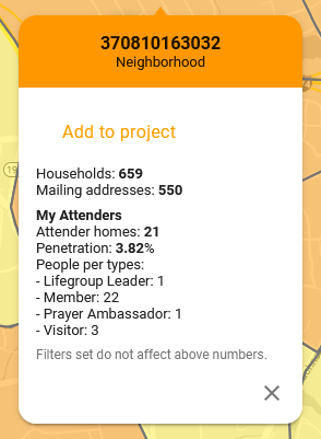
In the 'My Attenders' section of the infobox that appears, you will find the following:
If you zoom out on the map enough, the shapes will update to represent counties instead of CBGs.
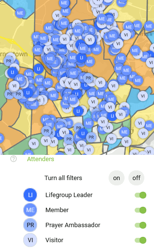
You may find it useful to turn on the attenders layer itself to see both the shaded regions and the individual attenders at the same time. To do this, select the 'My Church' layer in the control panel. Network ministries will see 'My Association' instead.
Once 'My Church' is expanded, select the 'Attenders' layer to expand it.
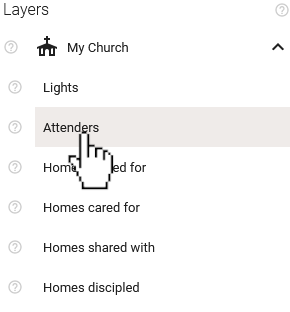
This will cause all of your uploaded attenders to be shown on the map.
Use the toggles for each attender type in the control panel to filter which attenders are shown on the map. The colors of the shaded regions of the Cluster Analysis will update automatically as filters are applied.
You can download a detailed report of similar information by creating and saving a project and then selecting either the Cluster Analysis .CSV or .PDF download type. You can find more information about projects in these articles: